Playing in the data pond

While talking about multiple data streams in the earlier posts of this series, we started using a term “data pond”. This is a concept we’re using internally in the context processing sets of streams, of the same or different types, that are usually somehow related - by source (e.g. a specific user or organization), domain (e.g. records from different patients) or processing requirements (e.g. data cannot be stored in cloud). Data ponds are very useful for simplification of data management, for example, in a basic scenario, adding a new stream to a project may require only dropping a file at a specific location. They are however also essential for analysis templates - sequences of transformations and analysis methods (generic or domain specific) that can be applied to streams in a pond.

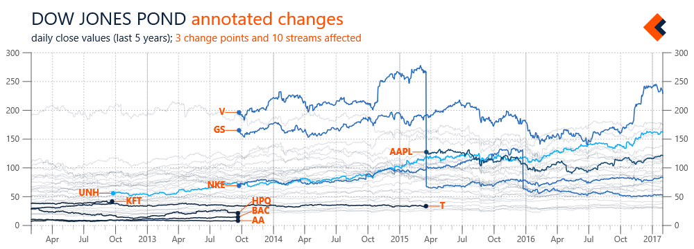
Figure 1 illustrates an example of streams automatically added to, and removed from, a data pond. Again, we’re using streams with daily close prices of Dow Jones components. In this case, information about changing the stocks included in Dow Jones are added to a definition of the pond and our framework automatically includes appropriate data streams, with applicable time constraints (so we don’t have to directly edit streams). However, the scope of a pond doesn’t need to be predefined; it can be also automatically determined based on availability of data streams in associated data sources. Monitoring the state of a pond can be further expanded with custom rules (e.g. tracking updates’ frequency) that result in chart annotations or notifications from the framework.

Figure 1 Overview of changes in the list of Dow Jones components with automated change annotations (SVG)

Figure 1 Overview of changes in the list of Dow Jones components with automated change annotations (SVG)

Data ponds are not only useful for data management, they are also relevant for analysis templates, which can be executed on individual streams or on a data pond as a whole. Analysis templates can be applied by default during the importing phase, and include normalization, error detection or input validation. They may also be executed conditionally, based on specific events or the nature of data streams. For example, the prices in Figure 1 were not processed, and the changes due to stock splits are clearly visible (see V or NKE). A stream with information about such events was added to a pond’s definition and used to trigger a template for all affected stocks. The result is a new series with split adjusted prices calculated for use in a chart with percentage changes (Figure 2).

Figure 2 Example of an analysis template automatically applied to calculating split adjusted stock price (SVG)

Figure 2 Example of an analysis template automatically applied to calculating split adjusted stock price (SVG)

Data streams about Dow Jones components are obviously just a simple example, but this case study can be easily adopted to more practical applications like analysis of individual stock portfolio (with sells and buys defining the scope). We find data ponds, and visualizations based on them, useful in different scenarios and types of streams: records from multiple points of sale, results from repeated research experiments, and logs from hierarchically organized server nodes. Data ponds can be used to improve the management of input data, with detection of new streams and application of initial transformations, but also to give more control over the scope and context of a data analysis. This is especially important for long-term or continuous projects (e.g. building more complex models) and enables interesting scenarios like private analysis spaces, where specific requirements, including security, need to be met.

Foreground vs background

In the previous blog post we looked at the processing of multiple data streams and using the resulting sets of data (referred as data ponds) as subjects of data analysis. This is often an effective approach to help with understanding specific phenomena, as a big-picture created from a number of series can reveal trends and patterns. Such a big-picture can however serve additional purposes, as it also can be used to establish a relevant context for the processing of an individual stream (that may, but doesn’t have to, be part of the data used to create this context). The results from analysis templates implementing such an approach can be effectively visualized, with focus on the individual series as a clearly distinguished foreground and context from multiple series presented as a background.

In the examples below we again use Dow Jones components, this time with the 5-year history of their daily close prices. Figure 1 includes data series for all stocks in the scope of Dow Jones data pond, without any transformations applied and with focus on Microsoft (MSFT).

Figure 1. Five-year history of Dow Jones components with focus on Microsoft stock daily close prices (SVG)

Figure 1. Five-year history of Dow Jones components with focus on Microsoft stock daily close prices (SVG)

This chart is not very useful, since the value range of MSFT price is small compared to the value range of the chart (determined by all series) and thus the foreground series seems rather flat. This problem can be addressed by transforming all the series in the data pond, as illustrated in Figure 2, where series’ value ranges were normalized to [0, 1] (we used this transformation also in the first post of the series).

Figure 2. Dow Jones background with value ranges normalized to [0,1] and Microsoft stock as the foreground (SVG)


Figure 2. Dow Jones background with value ranges normalized to [0,1] and Microsoft stock as the foreground (SVG)

Another type of transformation, often applied in practice, is based on calculating change from a previous value, or one at a selected point in time. Figure 3 includes results of such an experiment with the change (percentage) calculated against the first data point in the time frame (5 years earlier). In addition to MSFT stock, this chart also covers IBM, so that their performance can be easily compared.

Figure 3. Price changes (%) of Microsoft and IBM stock over 5-year interval with Dow Jones components background (SVG)

Figure 3. Price changes (%) of Microsoft and IBM stock over 5-year interval with Dow Jones components background (SVG)

In the examples above we focused on the visualization of individual series against the context built from multiple series. But obviously, the foreground-vs-background pattern can also be used for analysis, as the focus series can be analyzed in the context of all the others. Such analysis doesn’t have to be limited to a single series, but can focus on a subset, e.g. patients meeting specified criteria. The context build from multiple series may also be of different types - it can be personal (e.g. latest workout metrics vs results collected over time), local (e.g. sales from a specific location vs company aggregation) or even global (e.g. our performance in the competitive landscape). We’ll get to such scenarios, in different application domains, in the future posts.

Processing multiple streams

Working in a startup is about extreme resource management (which may justify the frequency of updates on this blog) and effective prioritization of tasks is the key to gaining, at least some, control over chaos. One practice we found very useful in these efforts is using real-life data with new features even during their development in order to get actionable feedback as early as possible. Often we simply start implementing a requested scenario that was the reason for selecting a specific feature. In other cases, we create small internal experiments, which we found very valuable not only in improving the features, but also in better understanding and explaining them. This a beginning of a short series focused on the results of such experiments.

The framework we are building is designed to help with advanced data analysis and one of the key requirements for effective analysis decision support is automation of different tasks. Some of these tasks may be complex, for example selecting an analysis method or incorporating domain specific knowledge, while others may be focused on simplicity, convenience or usability of data management. In this post, we are looking at the processing of multiple streams of the same type. This scenario is often needed in practice (e.g. sales data from different locations) when we want to build a big-picture to analyze differences and relationships between individual streams and to detect global patterns or anomalies. For this we needed functionality to effectively transform all, or selected, data streams in a set as well as properly modified analysis methods, starting with basic statistics.

In the experiments related to development of these features we were again using stock quotes data; this time specifically components of Dow Jones Industrial. We considered these components only as a set of data streams and when we talk about ‘average’ we refer to arithmetic mean, not Dow Jones Average (calculated using Dow Divisor). The chart in Figure 1 includes the daily close data series extracted from streams for components of Dow Jones since 2006, with min, avg and max statistics for the whole set.

Figure 1. History of Dow Jones components from 2006 with min, avg and max statistics calculated for the whole set (big)

Figure 1. History of Dow Jones components from 2006 with min, avg and max statistics calculated for the whole set (big)

As mentioned above, we need to be able to perform transformations on all these data series. An example of such an experiment is presented in Figure 2. In this case, the range of values for each of the data series in the scope has been normalized to [0, 1] (see feature scaling). As the result, all the series have the same value range, which make value changes in the given time frame much more visible. The visualization turned out to be interesting also because it nicely illustrated the impact of the financial crisis in 2008 on the stock market (automated annotation artifact added at the time point of the lowest average for the whole set).

Figure 2. Dow Jones components with value ranges normalized to [0,1] and annotation artifact indicating minimum value of average for the whole set (big)

Figure 2. Dow Jones components with value ranges normalized to [0,1] and annotation artifact indicating minimum value of average for the whole set (big)

Sets of data streams (internally we refer to them often as data ponds) can obviously be subjects for further analysis. They are essential for the analysis templates we develop, which due to their practical requirements often need to process many streams that are dynamically updated (including their arrival in and departure from a pond). Having specialized methods for processing sets of streams simplifies the development of analysis templates, which are based heavily on the transformations and applications of analysis methods. The big-picture created through visualization of multiple streams can also become a valuable background for presentation of individual streams, improving the visual data analysis experience. We will talk about these scenarios in future posts of this series.

Time aggregation case study

Whenever possible, we will use case studies and experiments to illustrate general concepts and specific features of our framework. We will try to create such examples based on different types of data. In some cases, we will use data streams within the context of a related application domain (e.g. healthcare or security). In other cases, we will use them as generic data samples, without considering their sources or possible goals of analysis. This post belongs to the second group, as we will use a stream of stock prices in order to illustrate some general challenges related to the nature of time dimension and the characteristics of time-oriented data.

In this post we look at time aggregation which is a transformation of data from a higher-frequency time granularity into lower-frequency statistics. This is actually a very common and practical scenario, applicable when we need to calculate aggregated statistics over intervals, for example a sum of weekly sales or a count of server responses per minute. The stock price data we use are also a product of time aggregation - they are last values for daily intervals (specifically adjusted close). The chart with the input stock price stream before aggregation is presented in Figure 1 (with horizontal lines for maximum, average and minimum values across the stream).

Figure 1: Input data stream with prices of MSFT stock since beginning of 2015 (SVG)

Figure 1: Input data stream with prices of MSFT stock since beginning of 2015 (SVG)

Time aggregation is a simple transformation that can be executed with a single command or a few intuitive gestures. It is usually parametrized with an aggregation interval and a summary function (e.g. count, average or standard deviation). The chart in Figure 2 includes our original data stream with a background of new data series created by aggregating the stream by MONTH intervals and with MAX/AVG/MIN functions. It is worth noting that the data series in Figure 2 are using both point (stock prices in navy) and interval (aggregated values in orange) time models. Since the base time granularity is determined by stock price (a day), we are using a stepped line for monthly summaries.

Figure 2: Input data stream aggregated by month with MAX/AVG/MIN summary functions (SVG)

Figure 2: Input data stream aggregated by month with MAX/AVG/MIN summary functions (SVG)

The first visible challenge with such a transformation is a different number of days in a month, and thus a variable duration of aggregation intervals. The mapping between different time granularities can be problematic also on different levels, for example in business scenarios, where analysis is focused on workweeks that are affected by irregular holidays. Analysis scenarios can become more complex if we deal not only with the time dimension but also with locations. Aggregating multiple data streams from different geographical points (e.g. sales across the country) can be affected by time zones, especially if short intervals as selected (e.g. daily statistics).

When using time aggregation, we need to pay attention not only to the time dimension, but also to other data elements, especially during selection of summary functions. Applicability of these functions depends on characteristics of analyzed data, e.g. calculating an average will not work with values of nominal or ordinal scales. But it also depends on context of data. In our case it wouldn’t make sense to calculate sum of prices per an interval, since our data points are related to a state (a price of an asset). However, if exactly the same values (including currency) would be related to events, like sale transactions, calculating average price per interval could be very useful.

We will discuss more detailed challenges related to analysis of time-oriented data in future posts. We will also show how technology can help with solving these problems.